Written by Kirk Laughead
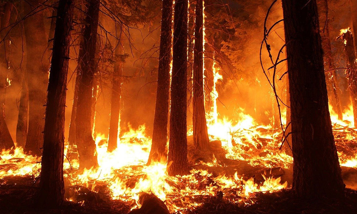
We are smack dab in the middle of fire season and it seems like the entire western half of the United States is going up in smoke. Lives are being lost, property is being destroyed, and there’s a certain fear gripping the area as the conflagration looms.
Rumors abound about who or what is causing the fires. Theories include lightning, downed power lines, and arson, with global warming or man-made climate change being named a major contributing factor. Several maps and memes are circulating on social media showing the fires leading right up to the United States border with Canada and with Mexico, and then stopping abruptly right at the official border lines.

The meme questions how climate change can abruptly stop at our borders and not impact Canada and Mexico. Though the real underlying premise is the belief that arson is involved and Democrats are blaming the fires on global warming and turning this into that proverbial crisis that must not go to waste so they can exploit the fires to push through their Green New Deal.
A WUSA9 fact checking article declares the story behind the memes to be false by questioning the quality of the source of the photo and the limited extent of the data that was used. The creator of the fire map, FireWeatherAvalanche.org, has responded to the claims by email explaining that their model “only maps fires in the 50 US states (excluding Hawaii)… data is sourced from various governmental agencies only.”
Dr. Jennifer Marlon, a forestry researcher at Yale, explained that “it’s very common for mapping databases to only show wildfires in the U.S. It depends on where your data set came from. You’re usually drawing from a data set developed by the government, so it only includes fires burning in the United States.”
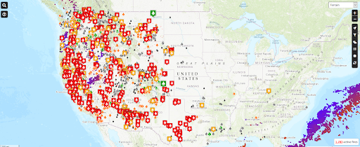
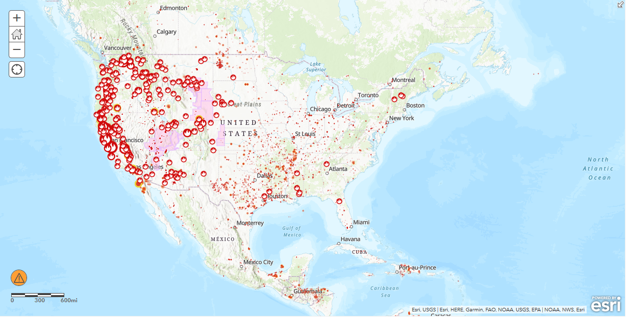
Image from FireWeatherAvalanche.org
The interactive map at FireWeatherAvalanche.org is slightly different from the one depicted in the meme above, but it’s basically the same concept and has roughly the same appearance, so it should be a good example for this purpose. There are some visual perceptions inherent in the way the fires have been depicted that tend to exaggerate the perception of there being fire everywhere.
This is due to the symbology that was used to represent the fires not being proportional to the size of the fire. They are just very big placeholders that are only intended to show where the fire is. Unfortunately, this creates the appearance that there is fire completely covering the entire western half of the United States. It’s also displaying air quality datapoints represented by the red and purple dots. They make the picture appear more cluttered, but they don’t represent fires as is evident by the major clusters being over the open waters of the Gulf of Mexico (lower right).
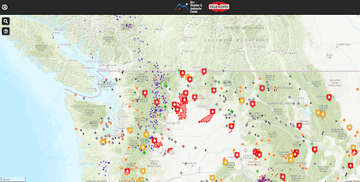
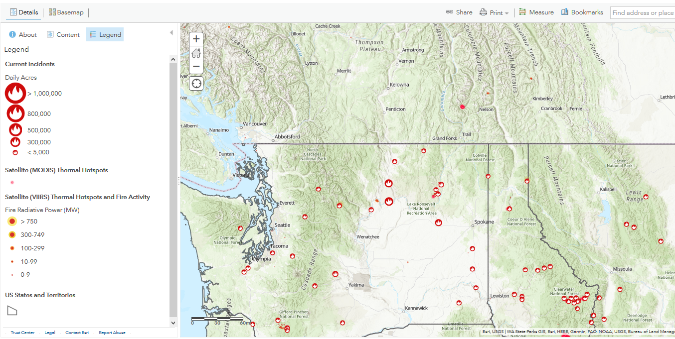
Image provided by FireWeatherAvalanche.org
Focusing on an area of the border between Washington and Canada provides a better idea of how spread out the fires truly are. The air quality points are more apparent as well. In this type of representation, the size of the symbols remains the same and does not change in relation to the scale of the map when you zoom in and out.
As you can see, the border area is very distinct and discreet and, as claimed in the meme, the fires appear to stop at the border. An abrupt line such as this might indicate a man-caused or human influenced phenomenon. It doesn’t look natural or random. It is this abrupt line of demarcation that the fires do not appear to cross that fuels the conspiracy theory about the fires having a nefarious origin.
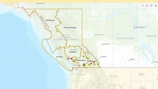
Photo provided by the Province of British Columbia official website
The fact checkers provided an additional image from an interactive wildfire map compiled by the Province of British Columbia that displays active wildfires in the province. They have acknowledged that there are not nearly as many fires north of the border in Canada as there are in the Western United States.
Per Dr. Marlon, “There can be quite a big difference between temperatures in Canada and temperatures in the U.S. It’s also about the moisture in the air and in the soils, and the moisture in the trees and the vegetation. The smallest differences in environments — from temperature to humidity to how dry the leaves are — can have massive effects on how and where fire spreads.”
The image provides more insight, but once again, the perspective is also limited because the data only covers Canada and does not include any fires in the United States.
ESRI Fire Map (9/19/20)
An interactive fire map provided by ESRI, a renowned industry leader, provides a better cross-border perspective. The same type of symbology has been used to represent the U.S. fire incidents. In addition, the ESRI Map has remote sensing data points that show fires burning across the border in Canada.
ESRI Map Focus Area (9/19/20)
A focus area similar to the one depicted previously shows fires on both sides of the border. The fires in Canada are from a satellite-based remote sensor. We can see that there are fires, but it’s hard to get a good perspective due to differences in the symbology. The fire data for Canada is depicted with a small dot that is proportional to the size of the fire, so many of the smaller fires are barely visible in this map image.
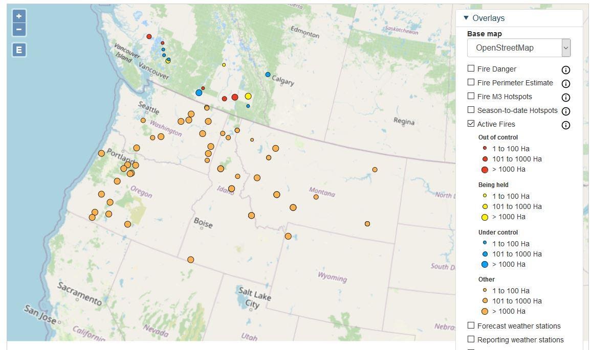
Map provided by Natural Resources Canada
Further research identified an additional map from Natural Resources Canada that depicts the fires on both sides of the border using the same symbology. There is a proportional representation that indicates the relative size of the fires by the size of the respective markers denoting them. The colors on the Canada side represent the status of the fire and whether it is out of control, under control, or being held. The status of the fires on the U.S. side is not depicted visually by color as it is in Canada. Though clicking on each dot launches an information box that provides the fire status data.
Though there are some minor cosmetic differences in the symbology, this image really provides a better perspective of the fires in Canada and the United States. You can see the pattern appears to be random. There is no line of demarcation at the border. If you were to remove the line representing the border you would not be able to tell where the actual border is. I’m confident from this analysis that there doesn’t appear to be any real anomalies in the natural distribution of the fires in the cross-border areas that would suggest a human influence in the distribution of the fires.
I believe that we can reasonably assume the claims that the fires stop at the border are false. Whether global warming has made the fire conditions worse is a different question, but still relevant in this case because of the severity and intensity of the fires.
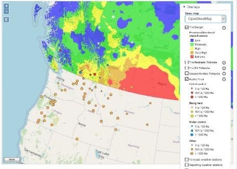
Fire Risk Map Natural Resources Canada
Adding a fire risk layer to the map adds a better perspective and dramatically illustrates the extreme general overall levels of fire risk. Though this depiction stops at the United States border, you can still envision how it might look if those areas were continued down into the United States in a similar order of magnitude as it is represented in Canada. It really gives you a better idea of the tinder box that is just sitting there waiting for an ignition source.
I’m convinced that the fire distribution is natural and there doesn’t appear to be any difference in any presumed impacts of global warming dependent upon which side of the border you are on. But we still don’t know how the fires were started. Were they naturally caused, accidental, or was it arson, as so many want to believe is the case? Perhaps it was a combination of all of those causes working together to create the perfect firestorm. We see that the potential for fire is there, but we still need a source of ignition. We will need to leave that for a future article.
Kirk Laughead earned his Associates of Science in Geographic Information Systems (GIS) at San Diego Mesa College. GIS is the science of digital spatial analysis and mapping.